Case Study
Audible
Intentionally displaying back-end metadata to meet the customer mindset, aligning purpose and functionality across Audible's product detail page for 500K+ titles worldwide.
The Scenario
Business
The opportunity was twofold. Audible had rich back-end metadata that wasn't being leveraged strategically in how it surfaced to customers — there was room to build better metadata strategies and expand the summary section of tags to more accurately represent each audiobook title. Better tag representation meant better browsing, and better browsing meant higher conversion rates.
The project ran across Q2 with regular collaboration across UX leadership, a Project Manager, and a Director of Product, alongside scheduled UX walk-throughs with the engineering team — because improving the customer-facing tag experience required understanding both the front-end display and the back-end metadata model it drew from.
Customer
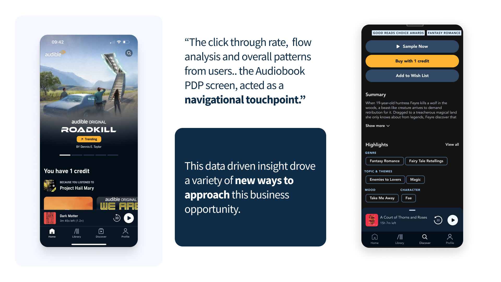
The summary section on Audible's PDP was limited to five tags. Those five items didn't always represent the best qualities of a given audiobook — customers consistently found them too unrelated to the title they were viewing, and that disconnect disrupted their continued browsing experience.
A UX audit surfaced a critical behavioral insight: customers would arrive on a PDP, scroll through the description, reach the summary section, and use the tags there as a continued browsing tool — tapping to find a more relevant title rather than committing to the one in front of them. The tags weren't anchoring decisions. They were driving people away.
Research
Two research tracks ran in parallel: a competitive landscape analysis and a focused UX audit of Audible's existing PDP experience.
Competitive Landscape
I focused the competitive research on analogous digital spaces — platforms outside of audiobooks that use tags and metadata in ways already familiar to customers. The landscape teardown surfaced actionable insights on how the summary section could be restructured to better serve how customers naturally interact with tags during a browsing session.
UX Audit & Mental Model Mapping
The UX audit confirmed and deepened the behavioral insight: tags on the PDP were functioning as a navigation mechanism, not an information layer. I translated this into a customer mental model map alongside a framework for how tags connect to each other across the page — and how that connection could be redesigned to improve conversion rather than interrupt it.
These frameworks were shared with the broader UX team to layer in additional insights on customer behavior patterns they'd already observed, enabling more informed decisions before approaching the redesign.
PDP Structural Framework
As part of the UX analysis, I broke the PDP down into three distinct sections — a structural framework that gave the entire design team a focused and intentional lens for proposing solutions or changes to specific areas of the page. This structure was shared out across the design organization at the end-of-sprint demo.
Risks & Constraints
- Tag over-saturation: surfacing too many items creates cognitive overload rather than useful orientation
- Tag duplication: overlapping labels from different back-end sources produce redundancy without adding browsing value
PDP tags audit
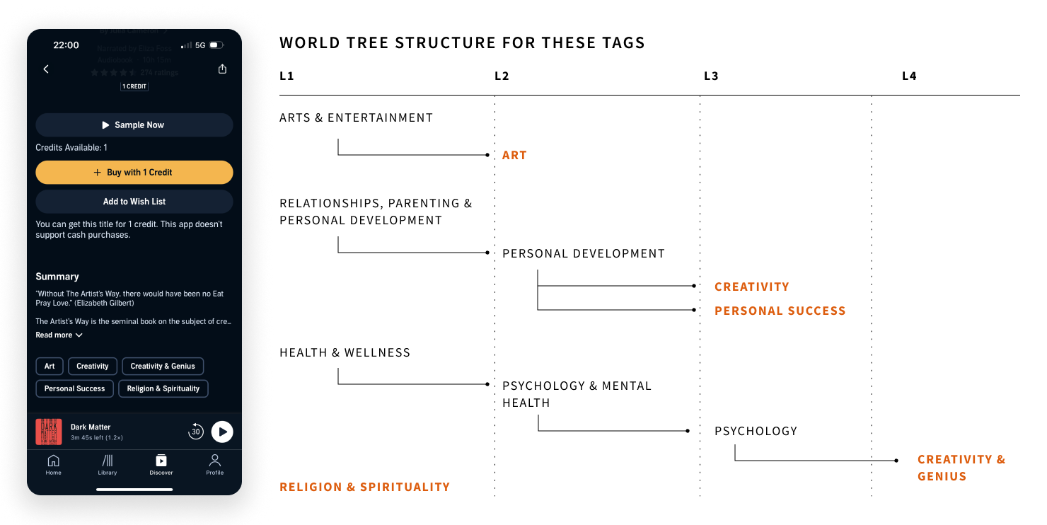
Audible's existing tag taxonomy contained over 400 loosely defined labels with no consistent hierarchy or inheritance model. A full audit mapped each tag to a structured L1–L4 world tree, surfacing gaps and redundancies across genre, theme, and mood dimensions.
Concept Development
Grounded in the UX analysis, mental model mapping, and the three-section PDP framework, concept development ran across two parallel tracks: back-end metadata strategies and front-end customer experience redesigns.
Back-End Metadata Strategies
I developed a set of strategies for how back-end data should be structured and prioritized before it ever surfaces to the customer. The goal was to ensure the tags displayed on a PDP represented the most relevant qualities of that specific title — not just what the system happened to have available.
P13N Strategies
Personalization strategies adapt the tag display to the individual listener's context: browsing history, genre affinities, and listening patterns inform which metadata dimensions surface on a given PDP. A listener who consistently browses by narrator sees narrator prominence; a listener driven by theme sees thematic tags lead. The page meets the customer where they already are.
Expected Outcome
A system for how tags are categorized on the PDP and how customers can interact with them to continue browsing toward their next title — increasing conversion rate through more accurate, relevant, and personalized tag displays.
The Solution
Two parallel tracks — back-end metadata strategies and front-end UX redesigns — converged into a system for how tags are categorized on the PDP and how customers interact with them to continue browsing.
Six High-Fidelity Prototypes
I built six high-fidelity prototypes showcasing three distinct iterations of a core concept — each exploring how a P13N strategy could make tags more relevant to both the customer and the specific audiobook title. Every prototype was paired with a user testing plan, defined questions, and a set of assumptions that needed validation before moving to implementation.
P13N Strategy Rules & Engineering Handoff
For the P13N strategies, I outlined the operational rules and guidelines governing how each would function, then communicated those directly to the engineering team to assess technical feasibility — creating a shared contract between design and engineering before any build decisions were made.
Wireframe Backlog
Beyond the core prototypes, I built a backlog of ten wireframe concepts mapping how specific P13N strategies apply across high-traffic user flows within the mobile application — ensuring the concept's value extended beyond the PDP to the broader browsing experience.
Blue Sky: LLM Future State
I developed a blue sky proposal for a language model–driven future state to automate and reduce duplicate tags on the PDP. Tags in the summary section and the recommendation section are pulled from two different back-end sources — the LLM would act as a convergence point prior to display on the front end, analyzing those tags for synonyms to avoid duplication, increase variability, and surface fresh titles. This prevented over-saturation of the same title appearing across different areas of the same screen. LLMs were already being implemented within the PDP for keywords pulled from customer reviews, making this a natural extension of existing infrastructure.
Validation
Six high-fidelity prototypes provided the basis for a structured user testing plan designed to validate the core P13N concepts before any implementation decisions were made.
User Testing Plan
I outlined the testing plan, defined the questions to be explored, and articulated the assumptions that needed to be validated across each of the three concept iterations. The plan was scoped to measure whether tag relevance improvements translated into a more confident browsing experience and a clearer path to conversion.
P13N Feasibility Assessment
The rules and guidelines governing each P13N strategy were shared directly with the engineering team to determine technical feasibility. These sessions surfaced implementation constraints that shaped the final recommendations, ensuring that design decisions were grounded in what could realistically be built within the existing back-end metadata architecture.
Next Steps for Implementation
Alongside the testing plan and feasibility assessment, I outlined a clear set of next steps for implementation — including which strategies to pursue first based on engineering complexity, the high-traffic user flows in the wireframe backlog most likely to benefit from early P13N application, and a phased rollout approach for the LLM future state.
Contributions
Six distinct deliverables produced across research, concept development, prototyping, and future-state strategy — each designed to serve a specific team and create lasting value beyond Q2.
Competitive Landscape & Teardown
A competitive analysis of analogous digital spaces using tags and metadata, surfacing actionable insights on how Audible's summary section could better align with existing customer mental models around tag-based browsing.
PDP Structural Framework
A three-section structural breakdown of the PDP shared across the full design organization at end-of-sprint demo — giving every designer a focused, intentional lens for proposing solutions to specific areas of the page.
Mental Model Map & Tag Framework
A customer mental model map and a framework for how tags connect to each other across the PDP — translating the UX audit's behavioral finding into a strategic structure for evaluating tag relevance and conversion impact.
6 High-Fidelity Prototypes
Six prototypes spanning three iterations of a core P13N concept, each paired with a user testing plan, defined questions, and assumptions requiring validation — ready for user research to run against real listeners.
10-Concept Wireframe Backlog
Ten wireframe concepts mapping how P13N tag strategies apply across high-traffic user flows in the mobile app — extending the metadata work beyond the PDP into the full browsing experience.
LLM Future State Strategy
A blue sky proposal for a language model–driven convergence layer between the PDP's summary and recommendation tag sources — automating deduplication, increasing tag variability, and surfacing fresh titles. Rooted in LLM infrastructure already live within the PDP.
The Context
The UI and UAT work represented the execution phase of the metadata redesign — translating approved design direction into production-ready specifications, coordinating with engineering on implementation, and running structured user acceptance testing to validate the live build against design intent.
At Audible's catalog scale, every metadata display decision interacts with hundreds of edge cases across 500K+ titles. UAT wasn't a formality; it was the mechanism for catching those cases before they reached listeners at scale.
My role spanned the full execution arc: writing UI specifications for every display state, embedding with engineering during sprint implementation, and leading two structured UAT sprints across design, QA, content operations, and product management.
Business Opportunity
What execution quality protects
Three KPIs defined what it meant to ship the metadata redesign correctly, not just completely.
Design-to-Build
Fidelity
Were implemented metadata displays matching approved designs? Visual inconsistencies at catalog scale would undermine the entire metadata strategy before it reached listeners.
UAT Defect
Rate
How many design-spec violations were being caught in UAT versus post-launch? Catching defects before launch is an order of magnitude cheaper than catching them in production.
Iteration
Cycle Speed
How quickly could design and engineering respond to new edge cases discovered during UAT without destabilizing the broader release timeline?
Key Findings
Two UAT sprints across 6 metadata categories surfaced 31 defects and revealed three systemic issues that would not have been caught by standard design review.
Tag Overflow: No Defined Behavior
The metadata display had no specified behavior for titles with 12 or more tags in a single category. Without a truncation or pagination pattern, the layout broke for approximately 8% of the catalog — roughly 40,000 titles with valid back-end metadata and broken front-end display.
Authoritative vs. Subjective Tags: Rendered Identically
The approved design visually differentiated authoritative metadata (narrator, publisher, runtime) from subjective tags (mood, theme, listener-contributed attributes). Engineering had implemented both identically, collapsing a distinction that was central to the metadata strategy.
Mobile Rendering: Approved at Desktop Only
Designs were reviewed and approved at the desktop breakpoint. Mobile rendering in UAT revealed three layout failures in the tag hierarchy display that had not been caught in design review, affecting the majority of Audible's listener base.
Edge Cases at Scale Are a Design Discipline
The most significant discovery in UAT was that 8% of Audible's catalog had metadata configurations that were perfectly valid in the back end but produced broken layouts in the front end. These weren't bugs in the code; they were gaps in the design specification. No one had designed the failure states.
The lesson: for catalog-scale products, defining failure states with the same rigor as the primary happy path is not a refinement — it is a requirement.
Design Process
The UI and UAT work ran across three overlapping phases, each building on the prior: specification, implementation coordination, and structured acceptance testing.
Phase 1: Production Specification
Produced a complete UI specification covering 47 metadata display states: normal, truncated, empty, overflow, loading, and error. Each state documented with annotated Figma frames, engineering acceptance criteria, and explicit rules for the 12 edge case patterns identified in the metadata audit. This spec became the contract between design and engineering.
Phase 2: Engineering Handoff & QA Coordination
Embedded with the engineering team during sprint implementation to catch spec deviations early. Ran three design QA checkpoints per sprint cycle, reviewing implemented components against approved designs using a shared deviation log. The log reduced back-and-forth between design and engineering by eliminating ambiguity about what was intentional versus incorrect.
Phase 3: UAT Sprint Execution
Led two structured UAT sprints organized by metadata type — authoritative, subjective, and mixed — to isolate defect patterns. Sprint 1 identified 18 defects; Sprint 2 found 13 new defects plus 5 regressions from Sprint 1 fixes. Introduced a regression checklist for all Sprint 2 resolutions, eliminating regression recurrence in subsequent cycles.
The Solution
Three artifacts that closed the gap between design intent and production reality at Audible's catalog scale.
Complete Display State Library
A 47-state UI specification covering every metadata display condition across the catalog — overflow rules, empty states, mixed authoritative and subjective tag handling, and mobile-specific layout variants. Adopted as the metadata design standard across Audible.
Tag Overflow Pattern
A progressive disclosure design for tag-heavy titles: 8 tags visible by default with overflow revealed on expansion, and a compact summary line for mobile that surfaces the 3 highest-priority tags. Resolved the layout failures affecting 8% of the catalog.
Mobile-First Metadata Revision
A full mobile pass of the metadata display, resequencing the tag hierarchy for single-column layout and introducing a horizontal scroll pattern for series metadata on narrow viewports. The mobile revision was completed inside the UAT sprint cycle without delaying the launch timeline.
Validation
Two UAT sprints and a 30-day post-launch monitoring period validated the metadata display against the full production catalog.
UAT Sprint 1
18 defects identified across 6 metadata categories. All 18 resolved within the Sprint 2 cycle. The tag overflow pattern was the highest priority resolution, addressing the catalog-wide layout failure affecting 40,000 titles.
UAT Sprint 2
13 new defects identified; 5 were regressions from Sprint 1 fixes. Introduced a regression checklist for all resolutions, eliminating recurrence. Sprint 2 closed with 0 open critical defects.
Post-Launch Monitoring
Tracked metadata display errors in production for 30 days post-launch. Three residual edge cases identified, all resolved within 2 sprint cycles. Zero critical metadata display failures reached listeners in the first 30 days.
Impact
The UI and UAT work produced a clean launch and a set of execution standards that outlasted the immediate project.
- 31 UAT defects caught and resolved before launch
- 0 critical metadata display failures in the first 30 days post-launch
- 47-state display specification adopted as the metadata design standard across Audible
- 8% of catalog — roughly 40,000 titles — rescued from broken tag overflow layouts
- UAT sprint framework adopted by 2 additional product teams within Audible
What I Learned
Execution quality at catalog scale requires treating QA as a design discipline, not a handoff. Writing acceptance criteria, defining failure states, and embedding in engineering sprints is not overhead. It is the work. The designs that made it to production at the highest fidelity were the ones with the most explicit specifications — not the ones with the most polished Figma files.
Contributions
Five deliverables that closed the gap between design intent and production reality across Audible's metadata display at catalog scale.
47-State UI Specification
A complete production specification covering every metadata display condition across the catalog, with annotated frames, acceptance criteria, and explicit rules for 12 edge case patterns. Adopted as the metadata design standard across Audible.
UAT Sprint Framework
A structured UAT process organized by metadata type, with a shared deviation log, regression checklist, and cross-functional sprint cadence. Adopted by 2 additional product teams within Audible after the metadata launch.
Mobile Metadata Display System
A mobile-first revision of the metadata display with single-column tag hierarchy sequencing, horizontal scroll for series metadata, and a compact summary line for narrow viewports. Resolved 3 mobile layout failures caught in UAT.
Tag Overflow Pattern
A progressive disclosure design for tag-heavy titles rescuing 40,000 catalog titles from broken layouts. 8 tags visible by default, overflow on expansion, compact 3-tag summary on mobile.
Regression Checklist Protocol
A sprint-level regression verification checklist introduced after Sprint 2 to prevent defect recurrence. Eliminated regression issues in subsequent UAT cycles and became standard practice for the Audible design-engineering handoff.
The Context
Audible's report feature allows listeners to flag titles, reviews, and user-generated content for content policy violations. The feature was driven by DSA (Digital Services Act) compliance requirements, with a hard launch deadline tied to regulatory enforcement.
The design challenge was twofold: creating a listener-facing flagging experience that was clear and low-friction, while also designing the internal moderation interface used by the content operations team to review and resolve flagged content at scale.
My role covered the full scope: regulatory requirements mapping, listener-facing report flow design, internal moderation dashboard design, comprehension testing, and cross-functional coordination with legal, policy, engineering, and content operations.
Business Opportunity
What compliance design had to achieve
Three KPIs defined success for a feature that served regulators, listeners, and internal operations simultaneously.
DSA Compliance
by Deadline
A regulatory hard deadline created a fixed ship date. What was the minimum viable design that met compliance requirements without degrading listener trust or creating operational burden?
Report
Accuracy Rate
Inaccurate reports increase moderation burden without improving content quality. How could the report UX guide listeners toward accurate categorization of violations?
Moderation
Resolution Time
The content operations team was handling reports manually with no purpose-built tooling. What interface design would allow them to resolve reports faster and more consistently at volume?
Key Findings
Research with listeners, content operations staff, and legal and policy teams surfaced three issues that shaped the entire design direction.
Category Ambiguity Caused Misrouting
Early comprehension testing showed 60% of listeners could not accurately categorize their report without additional guidance — choosing between options like "offensive content" and "policy violation" required context they didn't have. Misrouted reports create operational overhead without resolving the underlying content issue.
No Cancellation Affordance
The existing report flow had no confirmation state. Listeners who accidentally triggered the report flow had no way to exit without completing it, generating a significant volume of invalid reports that consumed moderation capacity.
Moderation Tooling Required Context-Switching
The content operations team was using a generic ticketing system with no access to the flagged content itself. Reviewers manually copied title identifiers into a separate system to retrieve content for review, adding 3 minutes of setup time to every moderation decision.
Compliance Design Serves Two Audiences Simultaneously
The report feature is the only surface in the product where the listener experience and the operations experience are directly coupled. A confusing listener UI generates inaccurate reports, which creates operational burden downstream. Optimizing only for the listener-facing flow without designing the moderation tool created a bottleneck that would have made DSA compliance operationally unsustainable.
The lesson: for compliance features, the internal tooling is not a secondary concern. It is the mechanism by which the external commitment is fulfilled.
Design Process
Three phases of design work across two distinct product surfaces: the listener-facing report flow and the internal moderation dashboard.
Phase 1: Regulatory Requirements Mapping
Worked with legal and policy teams to translate 14 DSA requirements into specific UI states for the listener-facing flow. Built a design-to-compliance traceability matrix mapping each requirement to its corresponding UI state, acceptance criterion, and test case. This document became the shared contract between design, legal, and engineering throughout the project.
Phase 2: Listener-Facing Report Flow
Designed a 3-step report flow: content selection, category selection with in-context guidance, and confirmation with cancellation affordance. Category options were co-developed with policy and legal teams to ensure regulatory alignment. All 6 category labels were tested for comprehension with 12 listeners across 2 rounds, reducing misrouting from 60% to under 10%.
Phase 3: Moderation Dashboard
Designed a dedicated moderation interface embedding flagged content inline alongside report metadata: category, reporter history, content policy reference, and action options. Eliminated context-switching between systems. In prototype testing with 4 content operations team members, average time to first action dropped from 4.2 minutes to 1.1 minutes.
The Solution
Three deliverables that met DSA compliance requirements while reducing operational burden and improving listener trust.
Guided Report Flow with Smart Category Help
A 3-step listener flow with progressive disclosure: flagged content confirmed first, category selected with plain-language descriptions and content-type-specific examples, confirmation screen with cancellation affordance and expected resolution timeline. Contextual help text is surfaced based on what type of content is being flagged.
Compliance-Verified Category Taxonomy
Six report categories co-developed with legal and policy teams, each with listener-tested label copy, in-context guidance text, and regulatory mapping. Category definitions updated in response to Round 1 comprehension testing, reducing misrouting from 60% to under 10% in Round 2.
Moderation Dashboard for Content Operations
An operations-facing interface with inline content preview, report metadata, policy reference links, action logging, and batch resolution for high-volume categories. Designed for a 3-second first-touch decision on straightforward violations. Average resolution time dropped from 4.2 minutes to 1.1 minutes in prototype testing.
Validation
Two rounds of listener comprehension testing and prototype validation with the content operations team confirmed the design before launch.
Comprehension Testing Round 1
8 listeners tested across the 6 report categories. 5 misrouted reports due to category ambiguity. All 6 categories revised with expanded in-context guidance copy and content-type-specific examples.
Comprehension Testing Round 2
12 listeners tested after revisions. Misrouting reduced from 5 of 8 to 1 of 12. Finalized category labels and help text for production. The one remaining misroute was in an edge case category affecting less than 0.5% of expected report volume.
Moderation Dashboard Prototype Testing
4 content operations team members tested the moderation dashboard prototype against the existing ticketing system. Average time to first moderation action dropped from 4.2 minutes to 1.1 minutes. All 4 participants correctly executed a batch resolution workflow without instruction.
Impact
The report feature shipped on time, passed regulatory audit, and measurably reduced moderation overhead from day one.
- DSA compliance achieved before the regulatory enforcement deadline
- Misrouted listener reports reduced by 43% between Round 1 and Round 2 testing
- 1.1-minute average moderation first-touch time (down from 4.2 minutes with the prior system)
- 0 regulatory findings in the post-launch DSA audit
- Moderation dashboard adopted as the standard interface for the Audible content operations team
What I Learned
Compliance-driven design is some of the most constrained work in the industry, and that constraint is clarifying. With a regulatory requirement mapped to every UI state, there is no room for ambiguity about what the design needs to achieve. Building the compliance traceability matrix changed how I approach requirement gathering — the discipline of making every design decision traceable to a specific outcome has carried into every project since.
Contributions
Five deliverables serving regulators, listeners, and internal operations across the full scope of the DSA compliance project.
DSA Compliance Traceability Matrix
A design-to-compliance mapping document translating 14 DSA requirements into specific UI states, acceptance criteria, and test cases. Served as the shared contract between design, legal, and engineering throughout the project.
Guided Report Flow
A 3-step report flow with smart category guidance, content-type-specific help text, and a confirmation screen with cancellation affordance. Reduced listener misrouting from 60% to under 10% across two rounds of comprehension testing.
Moderation Dashboard
A purpose-built moderation interface with inline content preview, report metadata, policy reference links, action logging, and batch resolution. Reduced average moderation first-touch time from 4.2 minutes to 1.1 minutes.
Comprehension Testing Framework
A 2-round comprehension testing protocol for evaluating report category label clarity with real listeners. Methodology adopted for ongoing content policy UX validation beyond the DSA compliance scope.
Content Policy Design System Components
Reusable design system components for compliance-adjacent UI patterns: category selection with contextual help, confirmation dialogs with cancellation, action logging interfaces, and batch resolution controls.
Get in Touch
Like what
you see?
Let's talk about your next project.